Showhouse Showdown, was a rare and exciting opportunity to showcase my skills and style on TV, The brief for this project was simple and precise from the offset, design a home for family living.
Having two boys, I know the necessities and design implications needed for a family home and this took centre stage when generating the concept for my design.
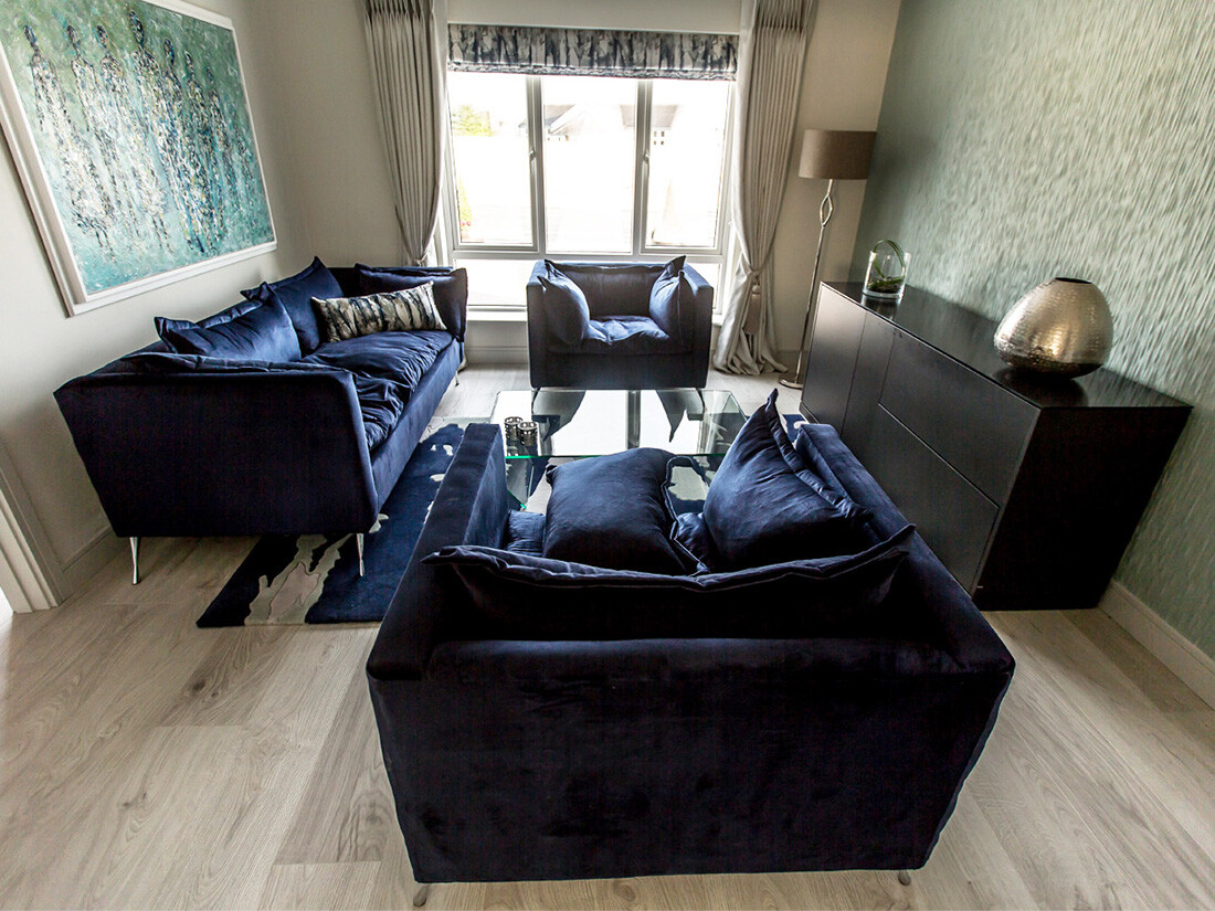
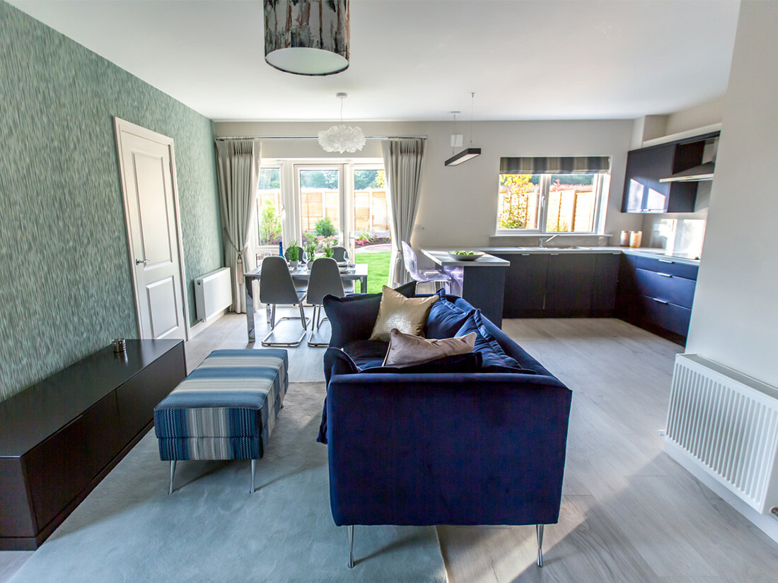
I designed a sofa, derived from a simple sketch, for comfort and slouching but also to withstand the imagination of a young child (tried and tested as a wrestling ring) using a commercial rated velvet on a customised frame it definitely ticked the box for durability, I then added an abstract Harlequin fabric (cushion) that set the colour scheme throughout the downstairs of the house.
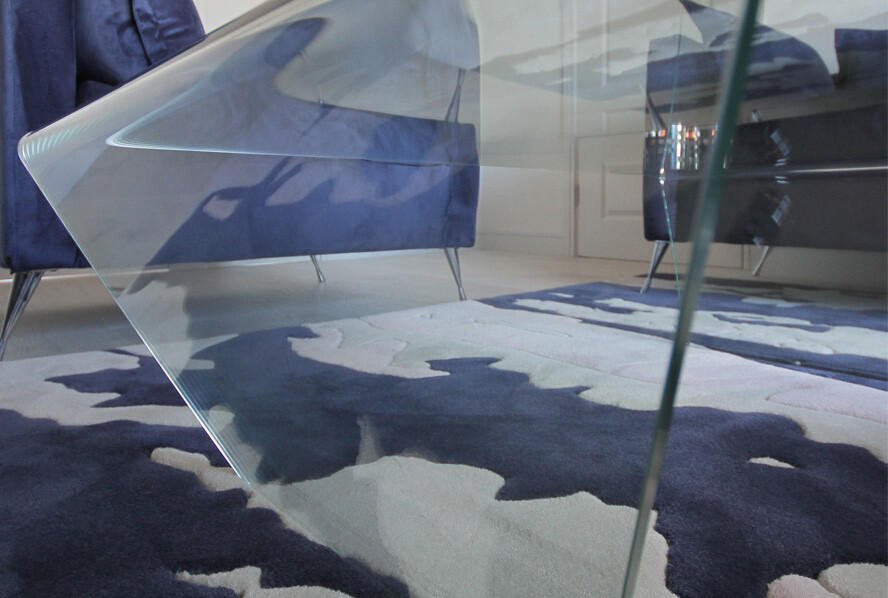
It was vital during this project not only to implement my style but also my love for simple and timeless design. In the sitting room In order to find the perfect balance of texture and colour I ran the abstract design derived from the Roman blind across the floor in a customised wool rug.
David from Rugs by Design dyed the wool to perfectly coordinate with the Indigo blue in the velvet on the sofa and the 2 Colourtrend wall colours Ocean Cruise and Oyster Bed. I painted the lincrusta Linoleum wall covering the lovely chalky green Ocean Cruise and used Oyster Bed as the perfect neutral on all the remaining walls, The heavy textured wall covering connected the TV room and sitting room which completed the design perfectly.
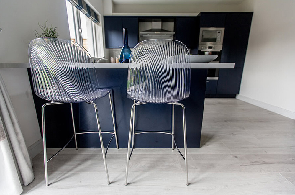
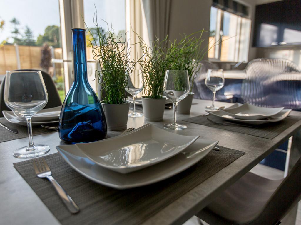
The modern range of furniture from the Italian company “Domitalia” represented my style perfectly. The modern tv unit and sideboard were the ideal storage solution for both rooms.The kitchen was offered as standard and had a restricted budget, using an innovative textured and coloured door was “my get out of jail card” for showcasing something a little different. I achieved a counterbalance with colour by using a very light white Grey in the worktop and tiles. My obsession with Indigo Navy carried into the hall with a Navy feature wall running up the stairs which coordinated perfectly with a striped “Roger Oates” runner.
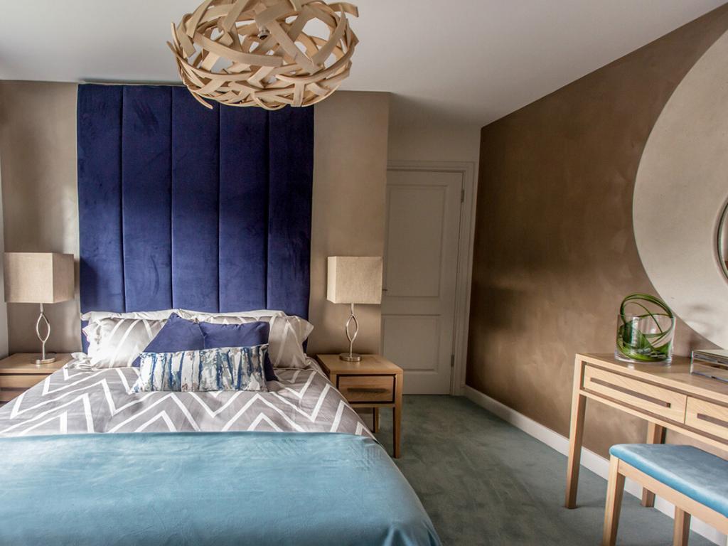
Using neutral tones and muted finishes in the bedrooms delivered a great calmness. By continuing the colour scheme upstairs I created a simple flow and connection from one space to the other, Once again Concar Designs worked tirelessly to colour match the concrete for my customised circular mirror in the master bedroom. I felt this would create a prominent feature in the room without altering the ambience.

